The project was about the solution of traditional Chinese character typing on Instagram Stories.
Started with the problem my friend had met -- the lack of Chinese font styles, as a UXer, I suggested launch user research for it. After that, I led the design process with the method of Lean UX to craft the product/app from 0 to 1. Eventually, the app “下筆 Fonting won a big hit that once achieved #1 among all free apps on App Store. Now, we are still iterating the app and looking for more business cooperation possibilities.
Product Designer
Lean UX, User Research,
Workshop, Wireframing,
UI Design, Prototyping,
Usability Testing
2 UX designers, 1 marketing, 1 engineer
2022.04 - NOW

Based on the research, the features below were made to solve the users' pain points, which were described in the area of "Design Process" in the following content.
Both the UX design & visual style of the app are simple. The spirit behind is "Less is more." We believe it's a great way to immerse users to be focusing on their writing and staying from cluttered distractions in this digital world.

The templates help users to get a quick start when they need some inpirations or just want to save time. On this page, not only can users use the defual templates directly, but also save/use their own custom ones.
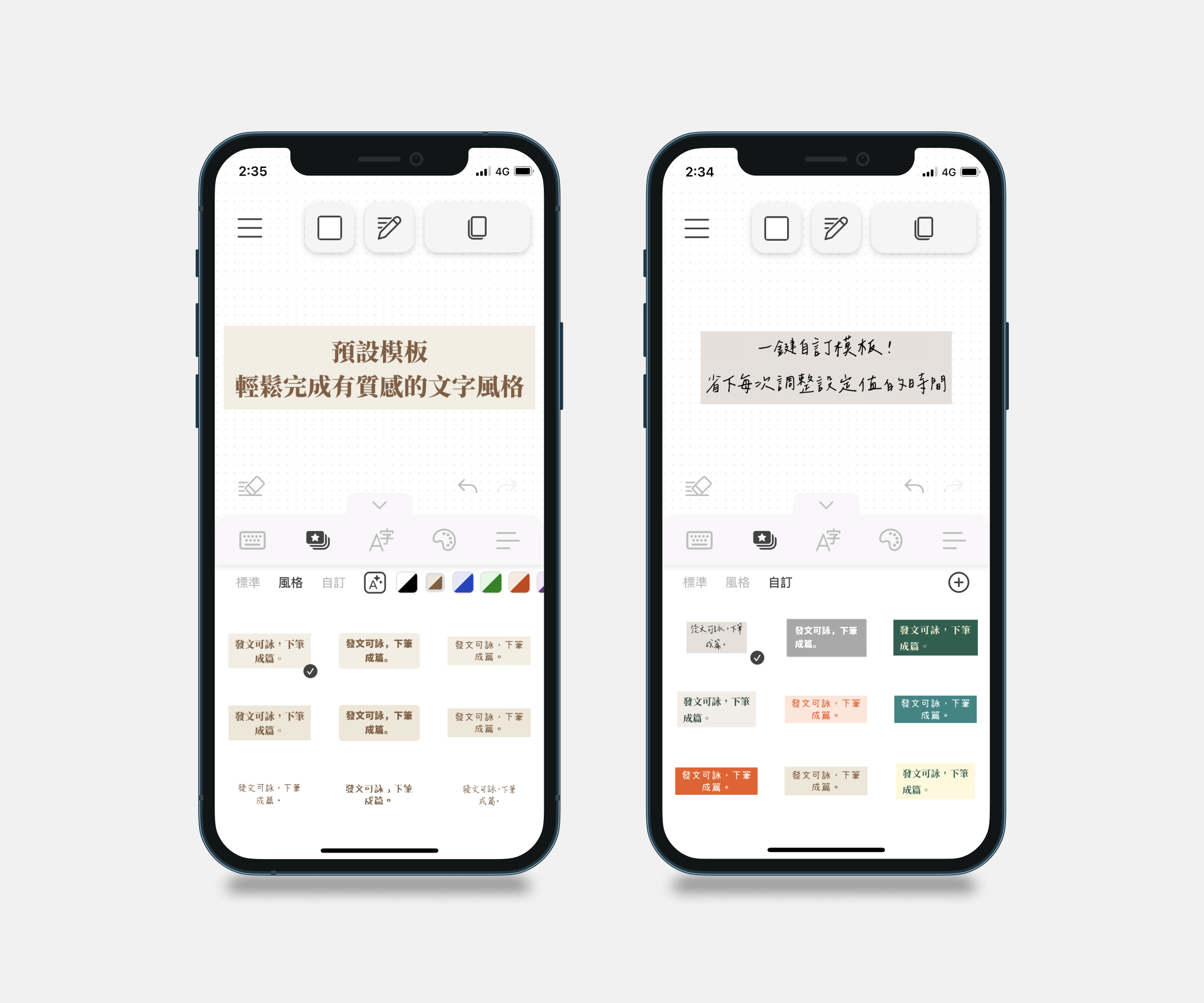
Firstly, there are 15+ built-in Chinese fonts to use in the app. Secondly, more fonts can be imported to the app by users if needed.

The choices of text color, background style and shaow on the panel are concise. It helps users to pick up one property effciently without wasting too much time on hesitating.

This page enable users to adjust the spacing of the letters/characters they type. By doing so, users can decide the extent of readability by them own.

The users can save their unfinished work in the draft folder until they complete the content or manually delete it.

The feature is still developing.

The product was developed through the method of Lean UX. I was the only designer before the product was launched in the end of June. After the product had been released on App Store, another junior UXer was invited by me as my partner for future collaboration.
During the whole design process, I was responsible for all the design matters, including conducting user research, facilitating workshops, crafting UI design, and testing & iterating the product based on the users' goals. I led the team from structuring user research to the first MVP. Until now, the product had been iterated for 5 times.
I conducted 6 user interviews in total.
---------
In typical design process of Lean UX, user interview is not the first thing to do. Instead, it starts with hypotheses based on our imagination of the users - "proto-persona." However, we didn't have any qualitative nor quantitative beforehand, so I decided to conduct the interviews firstly to know more about the scenarios and the end-users.
Aside from the painpoint that the Chinese font styles on Instagram Stories is not varied, below are the key insights from the users.
—— Key Insights
Following the above, 3 personas were bulit accroding to the interview data.

Considering the attribute of the team and the limited financial & time resources, I organized a Lean-UX-based workshop for design collaboration.
On the right is the whiteboard I made for the workshop.
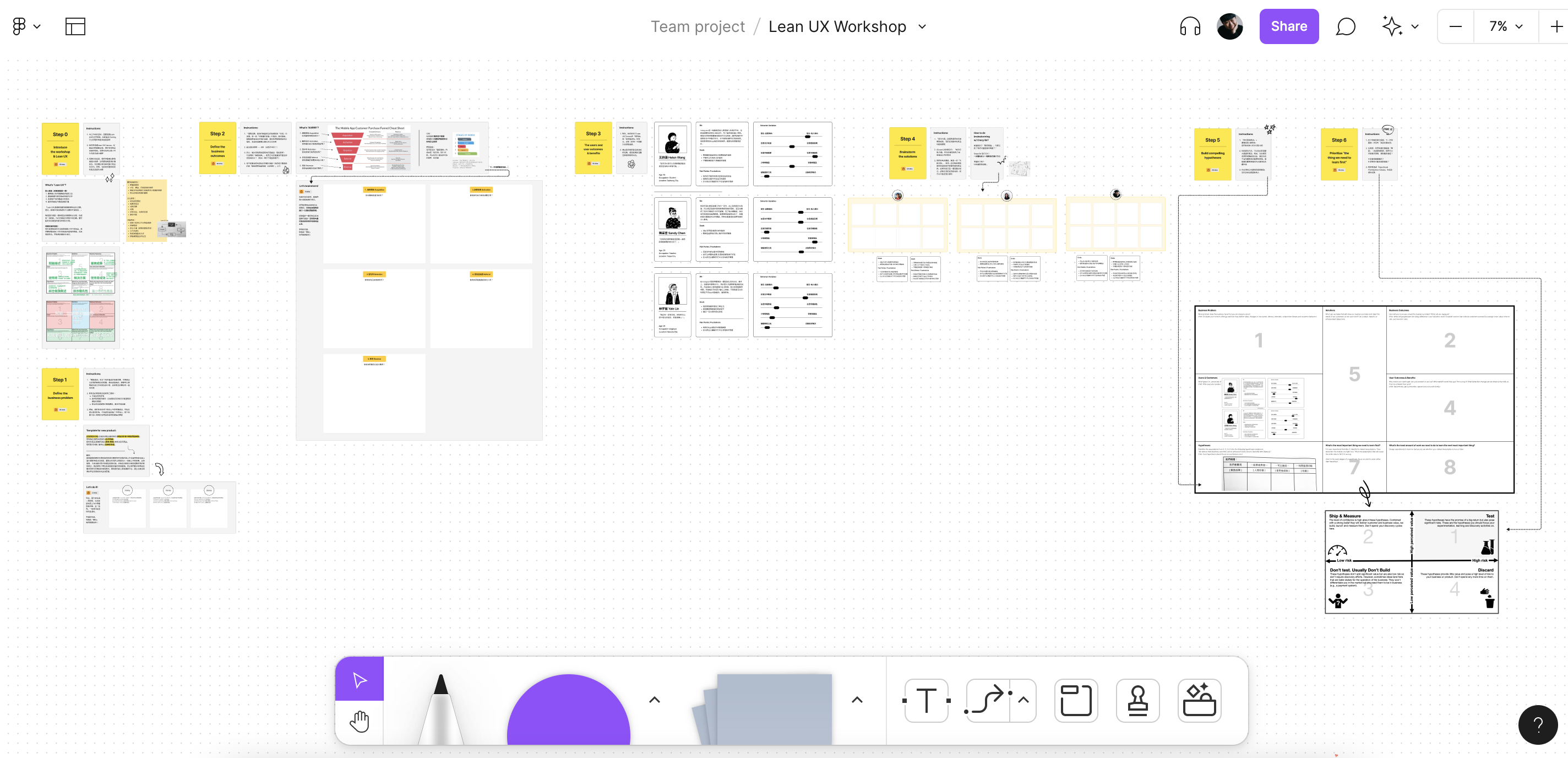
Canvas of Lean UX Workshop
Based on "Design Thinking", "Agile, & "Lean Startup", Lean UX is a solutions-oriented method for cross-functional collaboration. It's a cost-effective methodology which fits small teams like us.
In order to get design ideas and consensus with the team, I held an online workshop with the mindset of Lean UX. There were 3 participants in the workshop, and the duration was about 7 hours.
In this Lean UX Workshop, there were 7 phases in total. More details were shown below.
At the beginning of the workshop, I first introduced what "Lean UX" was, including its core values, cultural principles, and process principles.
Before moving on to the next stage, I explained the goal of this workshop -- Achieving consensus on product development & defining the indicatorssuccess

Intro of Lean UX Workshop
This phase was to define the "business problem" that everyone agreed on. It helpd our team to focus on the same vision.
Firstly, the participants wrote down the description of "business problem" of the product based on their own ideas. Each description should include the background of our product, the current market situation and the problems to solve. Secondly, the participants started to be on the same page by discussing all the descriptions they had written.

Intro of Lean UX Workshop
Here, through "The AAARRR Framework", we discussed our definition of "success" -- "business outcomes", which was also kind of the quantitative description of "measurable changes".
** "Business outcomes" are signals from the market that helped us validate the hypothesis.

The step 2. of Lean UX Workshop
To point out the users' need and what they wanted to achieve, the personas I had built were presented to the team.
**The typical way of making persona for Lean UX (also called proto-persona) would be created during the brainstorming in this phase. However, to learn more about the users, I bulit the personas from user interviews and presented them to the team.
At this stage, we brainstormed solutions by the "crazy 8s" in a short period of time. Based on the information from the personas, we ended up creating 26 ideas about the solutions.

The step 4. of Lean UX Workshop
Building hypotheses is a very essential start in the Lean UX process. Here, I led the team to sort out all the data in the previous phases, and made several compelling hypotheses --- the hypotheses were the best guess to success based on the knowledge we currently knew.

The step 5. of Lean UX Workshop
After creating hypotheses, the next step was to prioritize the hypotheses for testing.
Here, we use the "Hypothesis Prioritization Canvas by Jeff Gothelf" to help.
In the end, we picked 2 hypotheses. The indicator for picking hypotheses was "learning": through which hypothesis could we learn the most things and get the most value?

The step 6. of Lean UX Workshop
Following the above, this phase was to ideate the design of MVP. It took 6 hours to finish the process.
There were 5 stages in this prototyping workshop:
0. Intro & warmed the team up
1. Empathized the users through the personas
2. Defined the task flow of creating an Instagram Stories
3. Brainstormed the UI solutions
4. Sketched out lo-fi prototype
After going through the steps from 0. to 2., the step 3. was for brainstorming with "Crazy 8s" to collect a number of practical ideas for the UI design.
There came 18 ideas. After discussing the design concept, feasibility, risks, and benefits of each idea, we combined some of the ideas and moved them on to the step 4. - prototype sketching.

Step 3. Brainstormed the UI solutions
Finally, during the discussion of step.4, I facilitated the team to turn the ideas into sketches. The content included the task flow, components on the interface, the text information, the appearance of main features, etc.

Step 4. Disscusion druing prototype sketching
After the team had reached the consensus on the UI/MVP design, it took me 1 week to craft the first version of the MVP design and the operable prototype on Figma.
Soon after that, I had a very effective collaboration with the engineer for 2 weeks. Considering the time costs and technical problems, we constantly improved & interated the design during this period.
Before the product was officially launched on the App Store, I totally conducted 7 usability tests at two different time period (6/3-6/4 & 6/18-6/21). We found issues worth improving in almost every test result.
The test was taken online with Google Meet. Each test took about 1 hour. The first part of the test was to ask the participant to go through the tasks I assigned. The second part was the interview after the test.
We continuously improve the app. So far, the app has undergone 4 main updates (except for small updates like bug fixs), and the 5th one will be released by December, 2022. The update history was listed below:
The app "Fonting" won a big hit before we put any marketing budget on it.
Here are our business outcomes:
• 260,000+ cumulative app downloads on App Store
• Once ranked #1 of the category of "All Apps" on App Store
• Average user rating of 4.9 stars (2,200+ user ratings)
• 120,000+ monthly active users (MAU)
• Dozens of instagram posts, online blogs mentioned us without any marketing budget
This was my first project with market validation. Luckily, the outcome was satisfactory at the moment. To make myself more competent at my profession, here were the most important takeaways I learned:
First of all, to make the design iterations work well, it's better keep the design on Figme clean & tidy
. Because I neglected to organize the design documents regularly, I was having trouble finding my previous work after serveral design iterations. In the end, I spent hours rearranging everything, successfully keeping the engineer from getting lost in the design files.
Secondly, reaching a consensus with the team members before crafting any design is important. It makes the follow-up communication much easier. In this project, the consensus was reached through the workshops, so the team members were easy to understand the situation & the reasons of the design.
Lastly, remaining flexible enough to accommodate changes can help the team to come up more possiblity of ideas when facing an unexpected situation. For example, during the design process, due to the technology constraints and time schedule, we had to considered how to change the design without reducing the quality of UX.