The project was aimed to improve healthcare services in the hospitals. The consensus between the director of Digital Medicine Center of NYCU and our design team was to develop a mobile app to help the patients and their companions obtain essential information during their patient journey. Eventually, the outcome was an mobile app featuring AR navigation system and personalizd electronic medical record.
UX Researcher & Designer
UX Research, Workshop,
Wireframing, Usability Testing
2 UX designers, 1 visual designer,
1 PM, 3 engineers
2021.07 - 2022.06

The appointment info is updated in real time, allowing patients to manage their time more effciently.
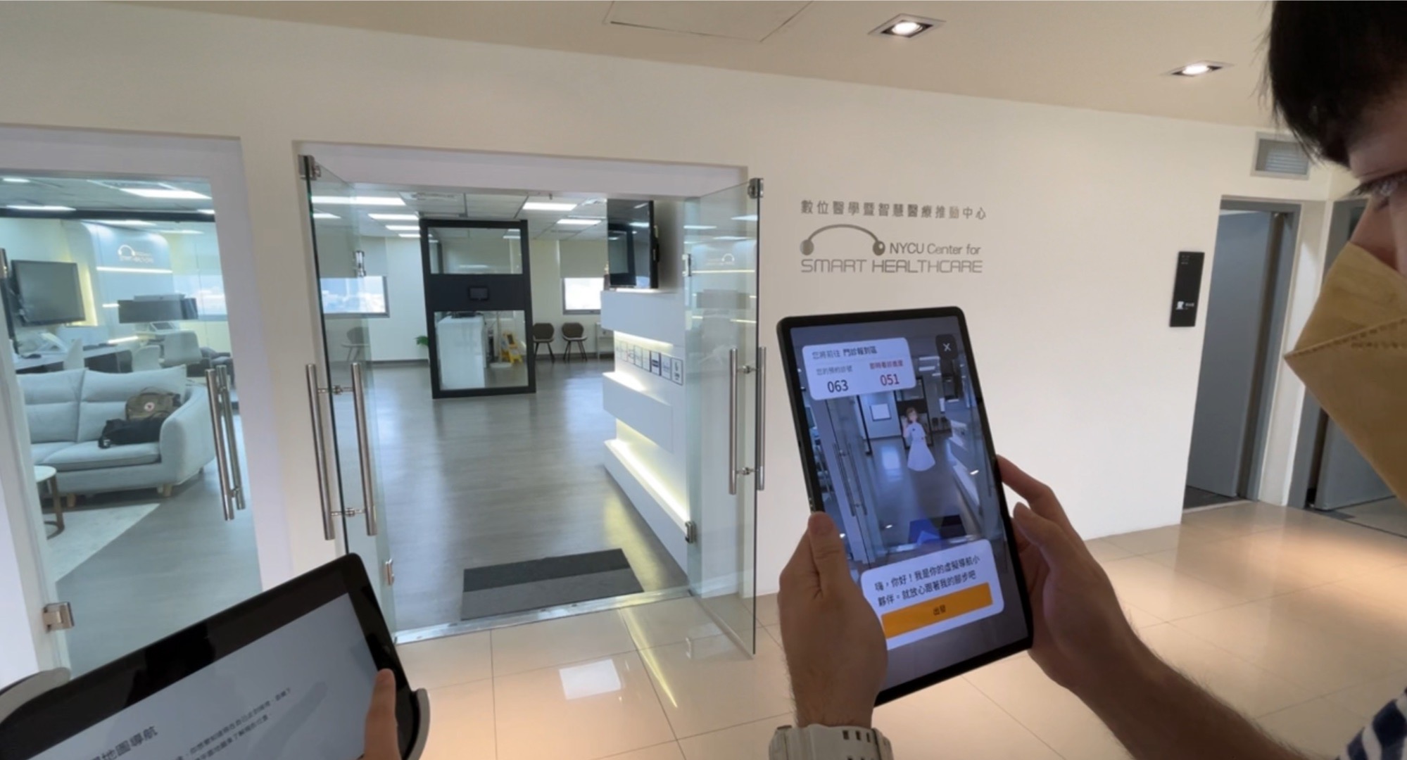
The navigation tool allows patients to quickly choose and customized the navigation route, reducing the anxiety of getting lost in the large hospitals.

On this page, patients can edit the navigation route freely through multi-point navigation. We also provide some common places to choose such as service counters, toilets and ATMs.

Through AR navigation, patients can clearly know the direction of the route, and at the same time, the friendly virtual character will tell them relevant information in a conversational manner when arriving at each location.

Patients can find the records of past medical treatment here, so that they can check the information at any time. In additions, they can also better understand their own conditions and better communicate with doctors when needed.

As a UX designer, during the design process, I conducted the UX research, host the design workshop, wireframed the app and led the usability testing. Besides that, I was also in charge of making design iterations and handing them to the engineers.
Cool Hunting is a methodology of seeking creative ideas by collecting interesting and inpiring case studies. In this section, we collected 35+ cases and chose 20 of them as the inspirations for the user interview part. Before the interview started, we first did the cool hunting to get boarder ideas about how design can help the relevant industries.

Examples of 6 cool hunting cases
In order to understand the users' needs and the stakeholders' points of view, we conducted 5 user interviews and 3 stakeholder interviews. (The content was limited by NDA)
The stakeholders we interviewed were 2 doctors and 1 hospital volunteer. After the interviews, we concluded two aspects of the data. One was "How the hospital system works for the stakeholders" and another one was "How do the stakeholders interact with patcients"
Among the 5 interviewees, two had chronic diseases and needed to go to the hospitals regularly; one was a companion; the other was a medical staff with the status of a companion. The findings were listed below.
According to the interview data and the behavior variables, we found three user types during patient journey.
After building personas, we used value proposition canvas to see if the values of the product and the values that users needed could fit each other. Based on the above information, we extracted serveral HMWs for each persona.
Information-hunter
Answer-seeker
Expert-believer
In the workshop, I was the host who led the workshop and from warm-up, brainstorming, ideation section to sharing time. The final outcome was three design concept with the scenario for each concept.
—— More Details
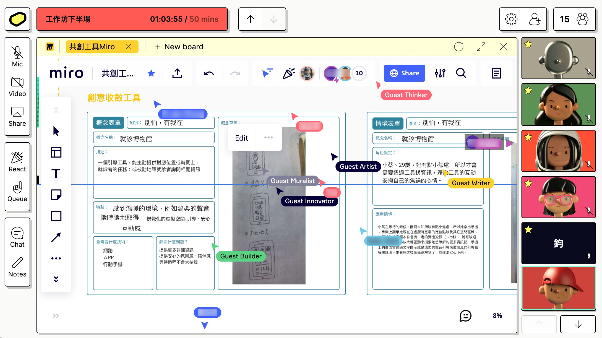
We recruited 18 participants and separated them into 3 groups. It was a 3-hour-long workshop held on Butter, an online meeting platform, and Miro, an online collaborative whiteboard.
To give the paticipants ownership and warm them up for the next section, we assigned an exercise that asked them to write down user painpoints and needs from the scenario of each persona. For example, the group 1, was assigned to "Information-hunter's scenario" and the group 2 was assigned to "answer-seeker's scenario."

Screenshot of the workshop in the beginning

The scenarios in the exercise
To get more design ideas from the participants, we made "the Brainstorm Canvas" for this section. In this section, the participants were led to complete the canvans step by step. After the canvas was done, we had a discussion and voting section to ensure that all the design ideas were fully comprehended.
—— The rule of the canvas :
In the upper left corner was the persona that the group was asked to think of. To finish the canvas, first of all, fill in "the touch points in the hospitals" according to the persona. Secondly, fill in "HMWs" in the leftmost column accordingly. Last but not least, the remaining fields were to fill in the corresponding design solutions. (Each participant was asked to write down at least 5 solutions within 25 minutes.)

Screenshot of brainstorm process and the Brainstorm Canvas
To ideate the design solutions, each group had to choose one solution or one mixed solution, and came up with the design details about it, including the title, the discription, a drawing that visualized the concept, features, essencial technology, problems to solve, and the scenario.
Screenshot of ideation process
To ensure that we are on the same page regarding the result of each group, we invited each group to share the design concept and made further discussion if needed.

Screenshot of sharing time
Following the ideation workshop, the goal of prototyping workshop was to create lo-fi prototypes to imagine how the design worked in real world. The workshop was held physically. The process can devided into three steps.
—— More Details
We recruited 15 participants and separated them into 3 groups. The duration of workshop was around two hours.
After the introduction section, we presented the three design solutions that coming from the previous ideation workshop. By doing so, the participants could start to imagine how the design solutions converted to paper prototypes.
In order to let the participants comprehend the details in the patient journey, they built the user journey map by filling in the information about journey steps, needs & pains, touchpoints, and the score of user feelings.
We provide drawing papers, UI checklists, crafting materials and ralvant stationery, encouraging participants to be creative in this prototyping time.
It's the time for sharing! To switch the paper protopypes to the presentation mode, the participants had to make the process to a video. We played the video by a project so that everyone could see it clearly. Soon after the video was finished, the group started to explain how and why they made the prototypes.

Process of prototype workshop

Snapshot of user journey map( for"expert-believer" )
Based on the previous information, we made this wireflow after more than five revisions. Then, the wireflow was delivered to the visual designer for an aesthetic and delightful user interface.

Wireframe of the app
The UI design was our final solution which were already shown on the upper part of this page. The details were limited by NDA.
The UI design of the app
The usability test was conducted in the Medicine Simulation Center, which was built for demonstrating updating medical devices from Digital Medicine Center of NYCU. We designed 4 tasks to test if the participants can complete the primary features in the app.
Once the test procedure was done, the qualitative and quantitative data were collected, including the observation during the test, the duration of each task, the interview after the tasks, and the data from System Usability Scale (SUS). The SUS scale in average was 77.5, which meant the design was acceptable for users to use.
Overall, The findings shown 4 usbility problems and 6 bugs of the app. After meeting with engineering team, due to the technical limitations, only two problems and three bugs will be solved on the next iteration.
Process of usability testing

Process of usability testing
The mobile app we designed has already been set in the Medicine Simulation Center, to demostrate the possibility of future hospital in Hsinchu. The unsolved problems and technical limitations of the app are supposed to be resolved in the next design program.
As a junior designer, the reflections after the project were the precious learning materials that push me to upgrade myself in the next project! Below were my reflections.
First of all, the stakeholder in this project was so busy that it was hard to contact him, not to mentioned arranging a meeting. Thus, I always worried about the ownership of the stakeholder and the his understanding towards the app. My reflection: Remember to send the project deliverables to the stakeholder after we finished every schedule milestone, to make sure that he was informed about all the information in details.
Secondly, because of techological limitations, the performance of AR navigation cannot work well. For example, in the AR navigation mode, the interaction of avatar was unstable that it would easily move outside the frame if we moved too quickly. From my point of views, it was caused by information gap between designers and engineers. My reflection: We should check details of the feasibility in the very begining, not just an oral promise, but a document that prove the feasibility.